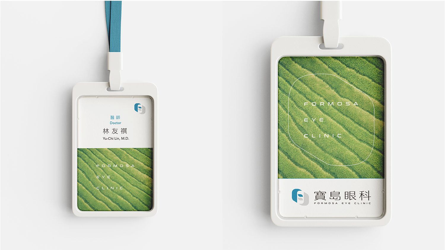
設計概念:傳承與革新的視野
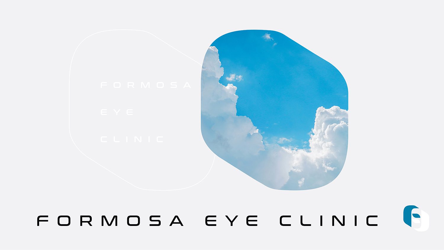
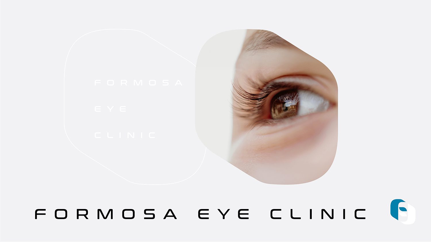
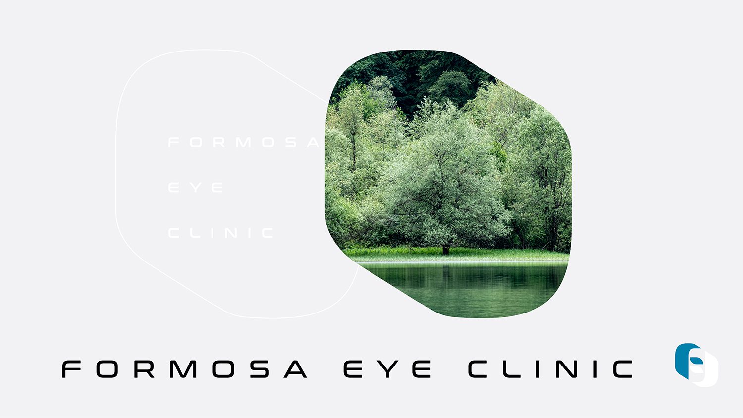
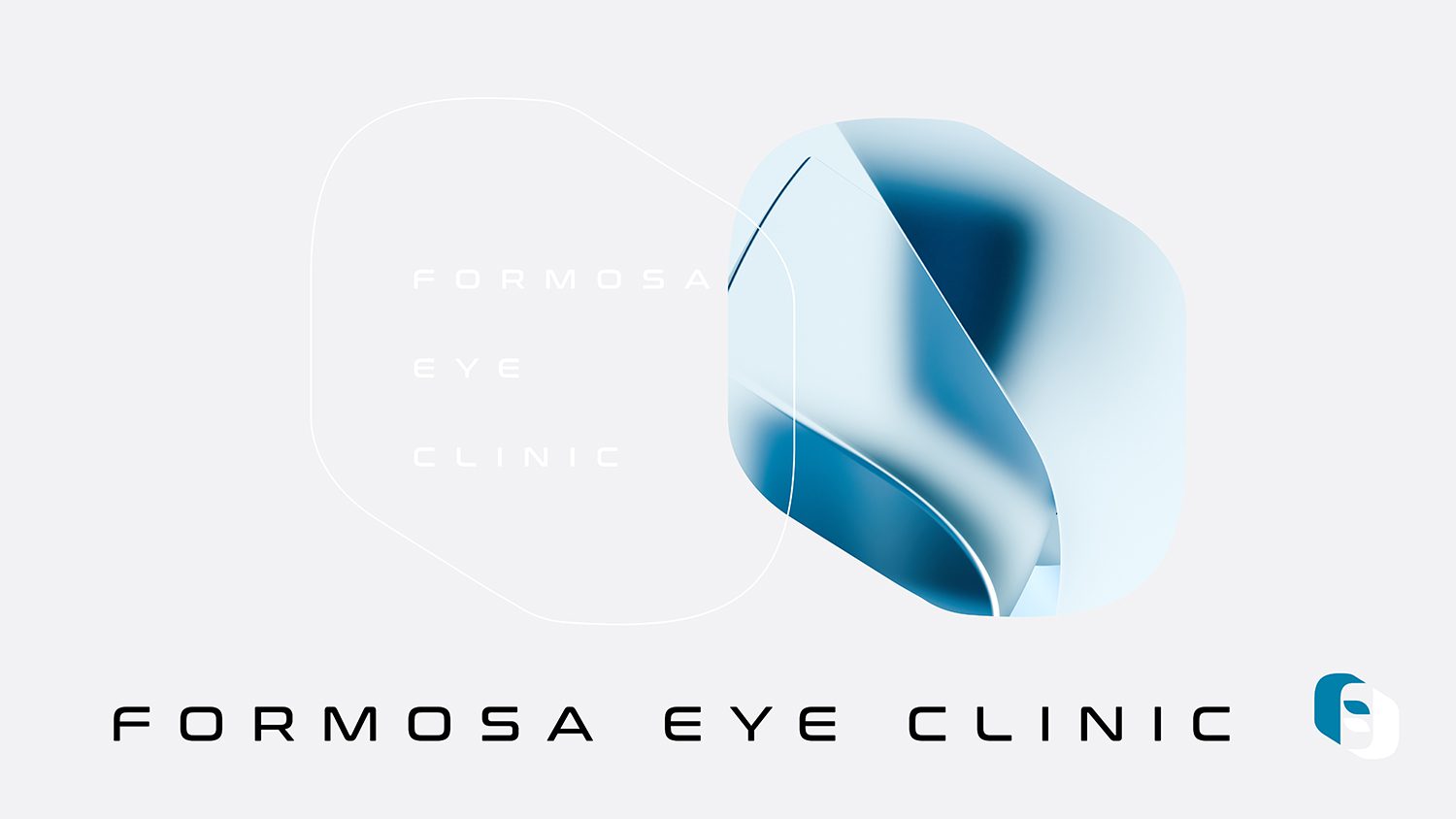
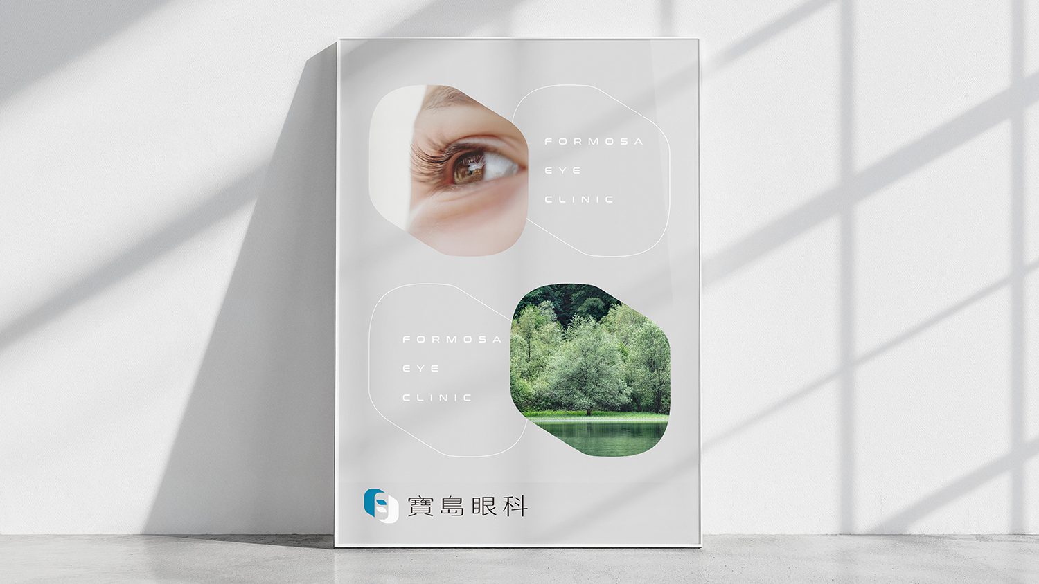
「寶島眼科」源自台灣家喻戶曉的「寶島眼鏡」,在延續四十年的品牌資產之上,我們試圖透過視覺語彙,重新定義現代眼科診所的形象—「既是專業的醫療場域,也是溫暖的視力守護者」。
標誌構成:F 的雙向交織
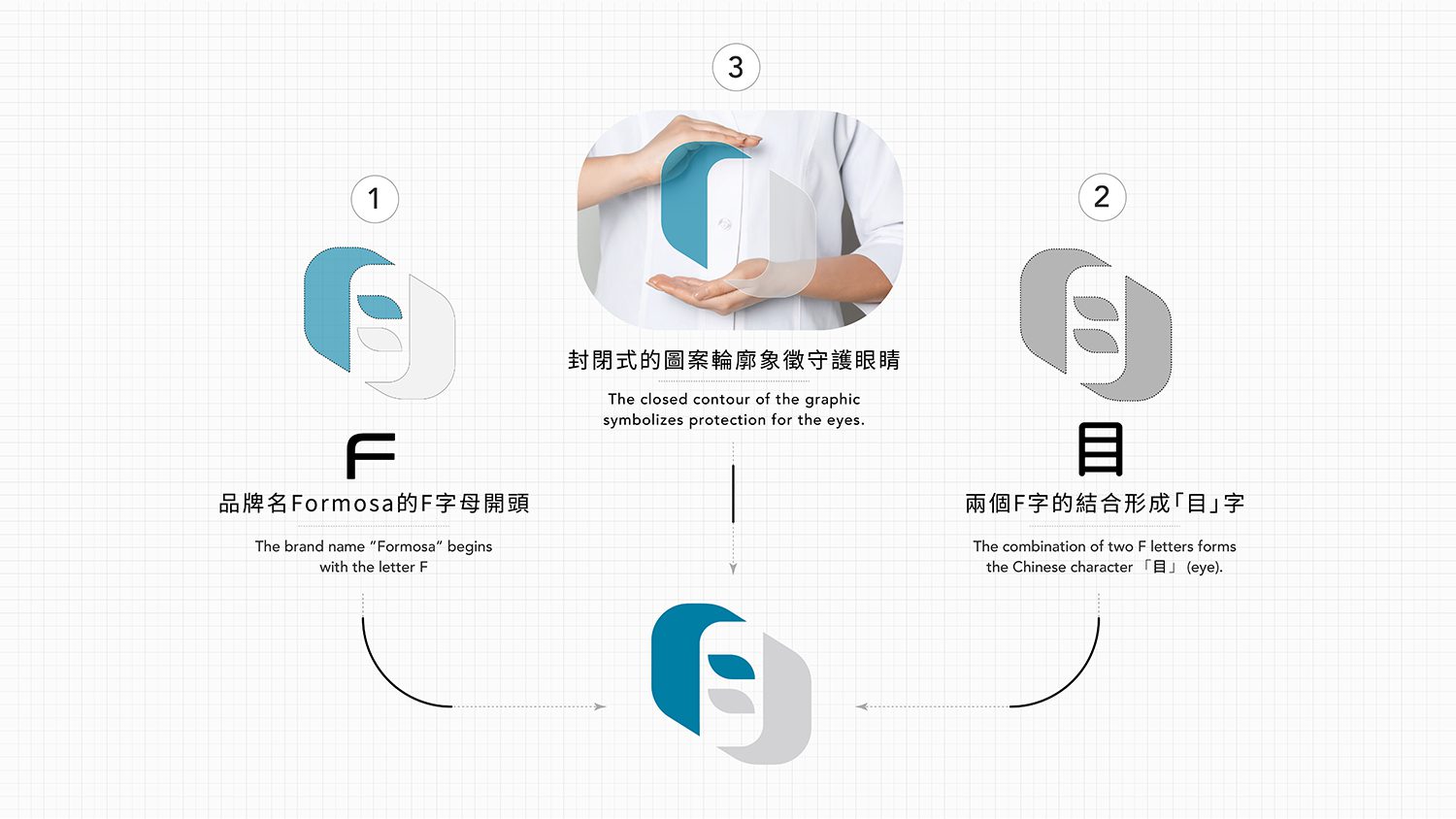
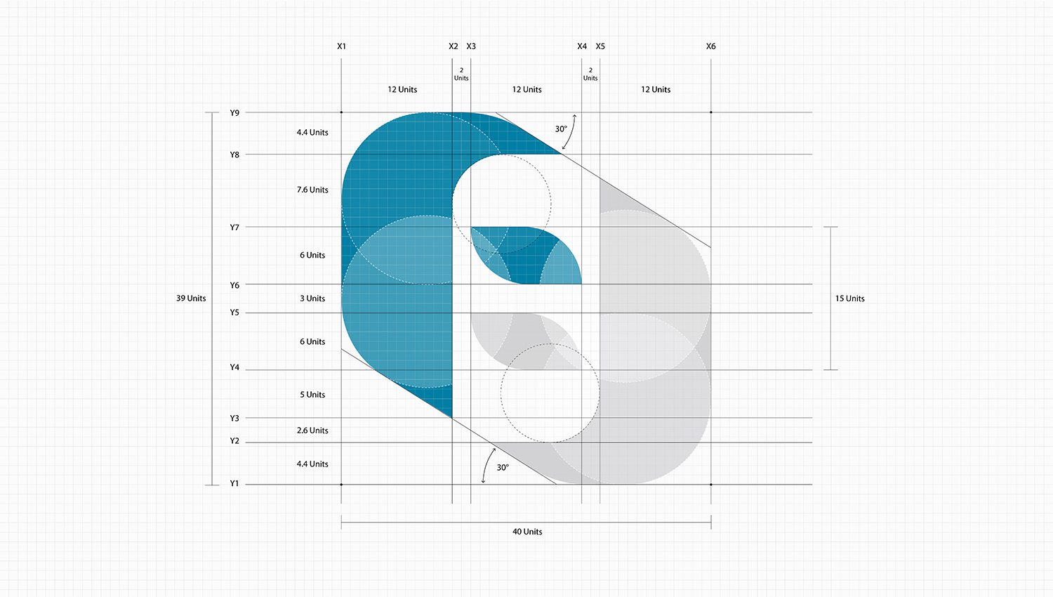
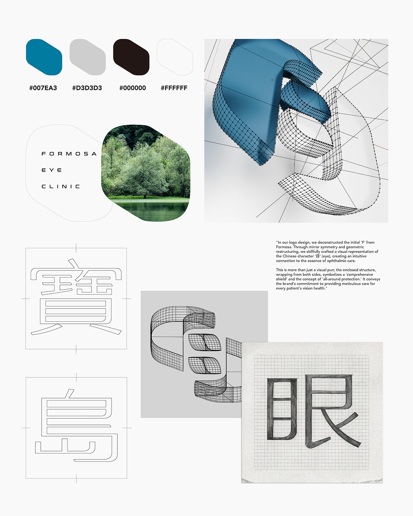
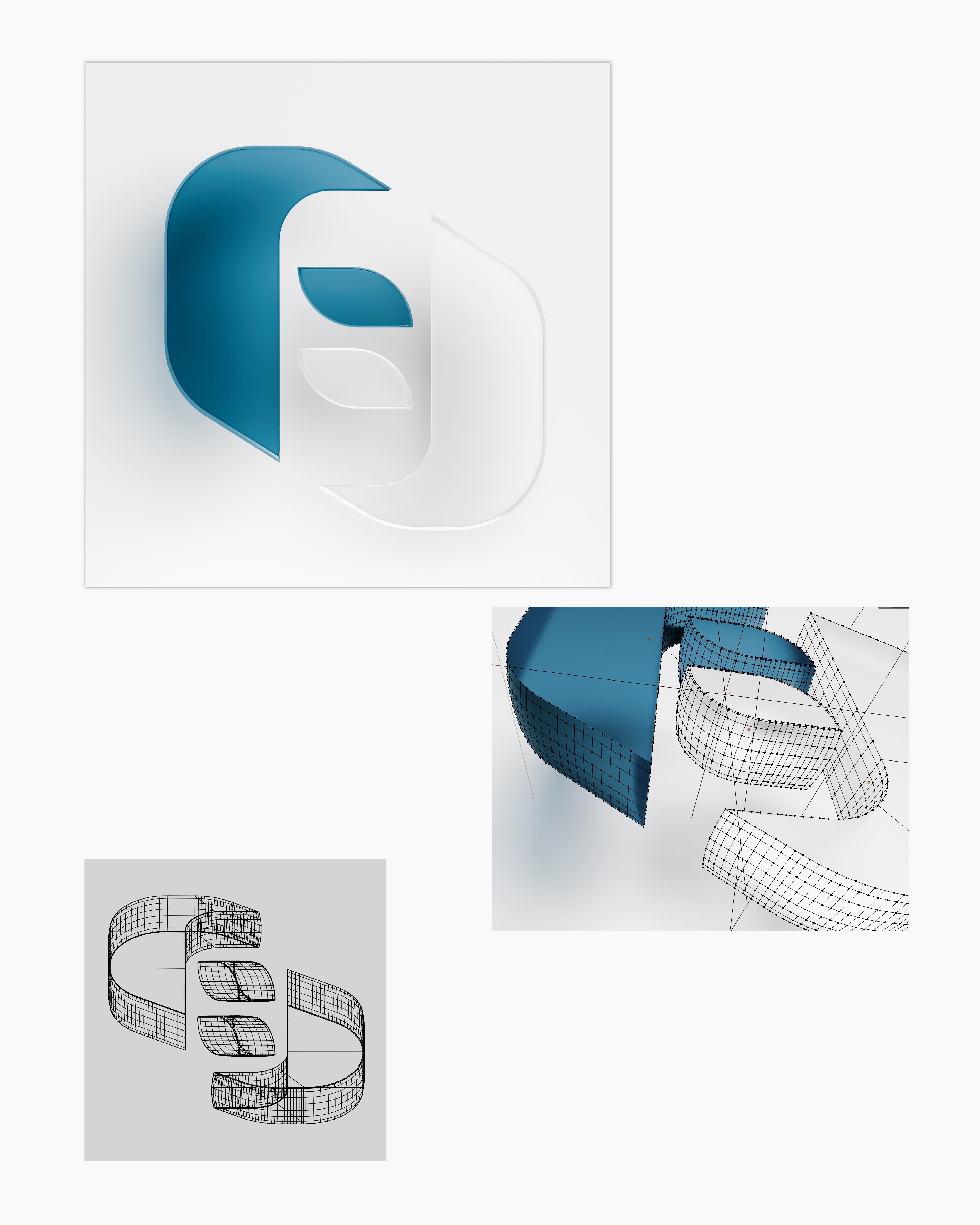
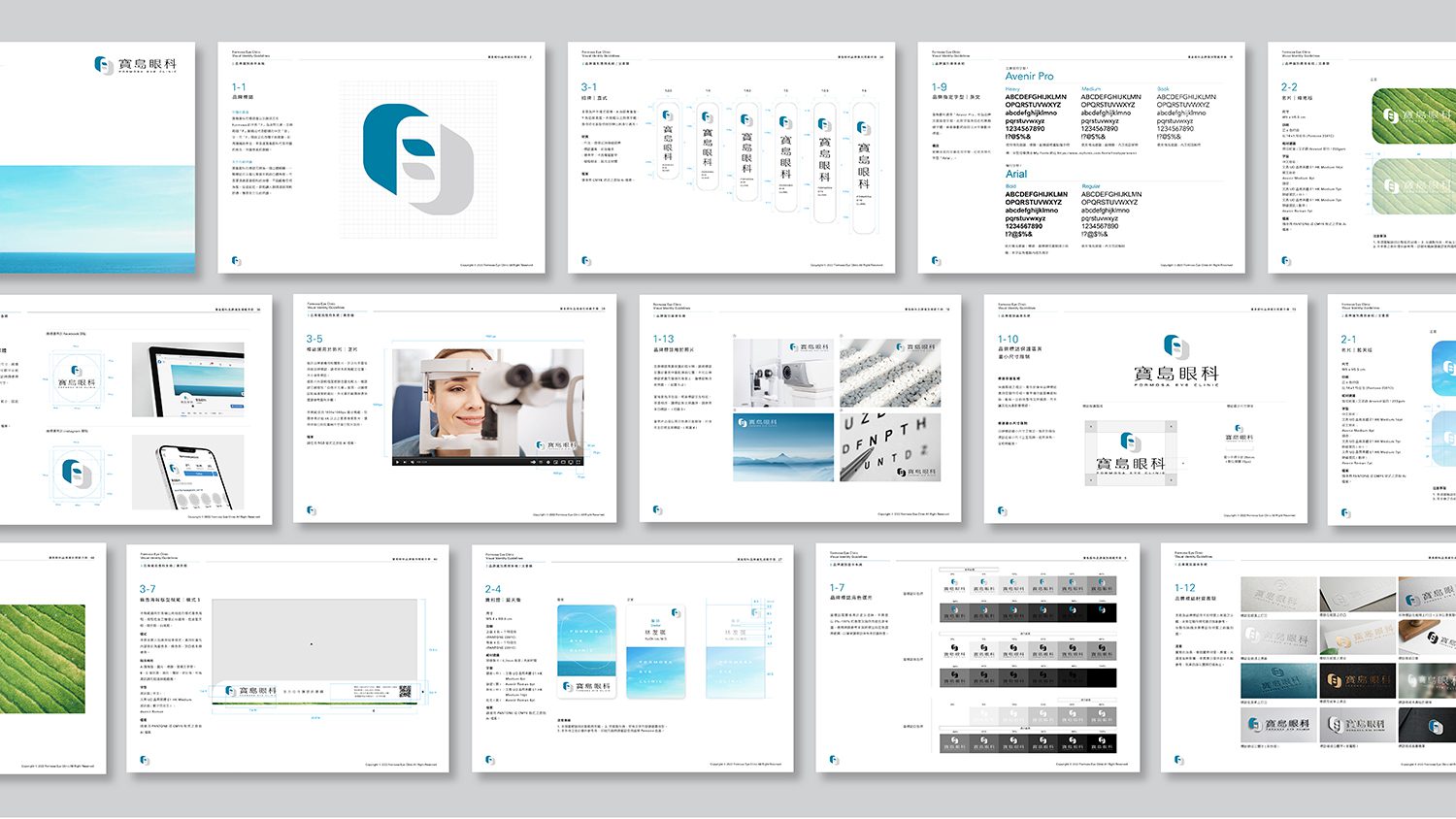
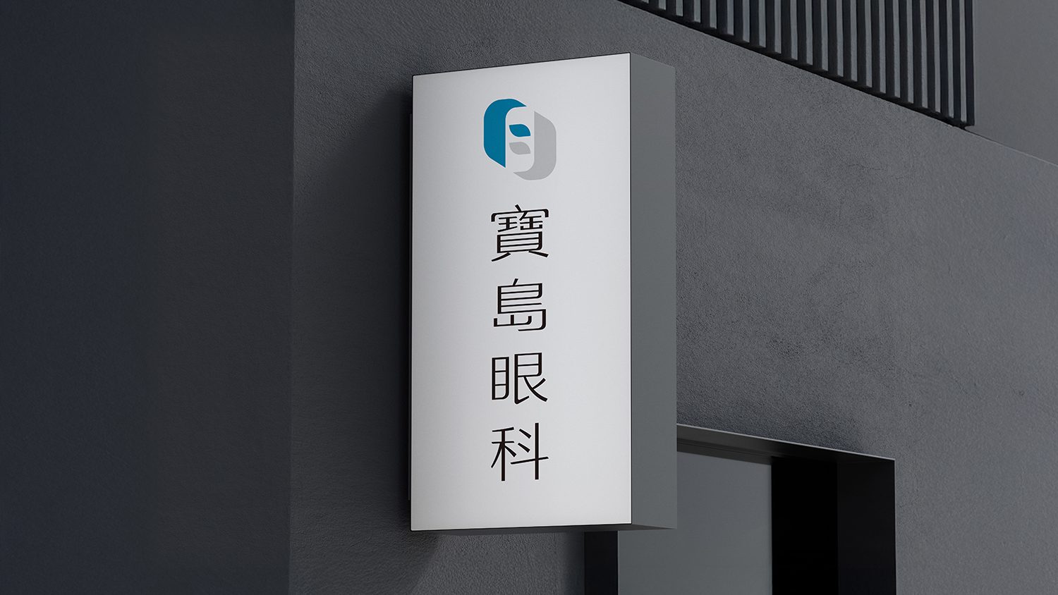
在 Logo 設計上,我們解構了 Formosa 的字首「F」,透過鏡像對稱與幾何重組,巧妙構建出漢字 「目」 的視覺意象,直觀呼應眼科醫療本質。這不僅是視覺上的雙關,圖形左右環繞的封閉式結構,更象徵著「全方位守護」與「視力防護罩」的概念,傳遞品牌對患者視力健康無微不至的呵護與承諾。
字體工藝:人文與科技的平衡
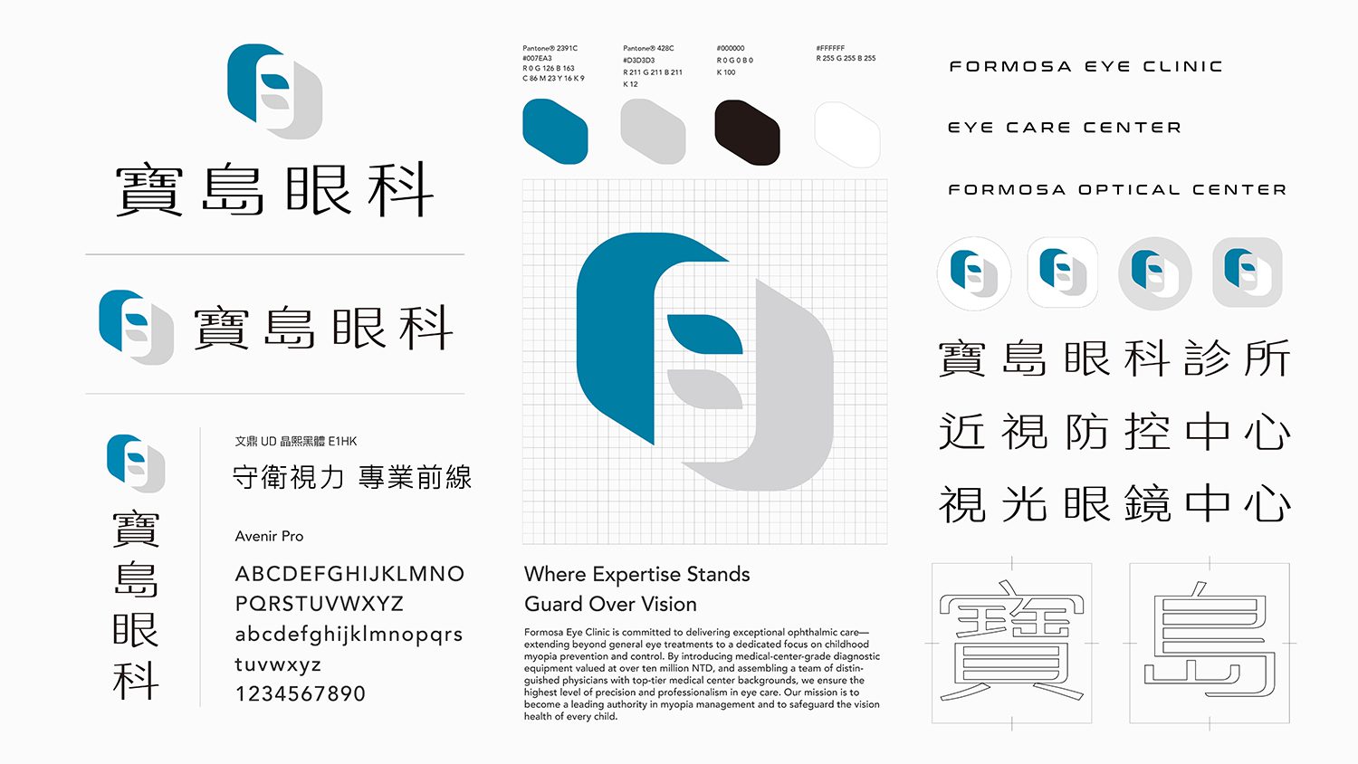
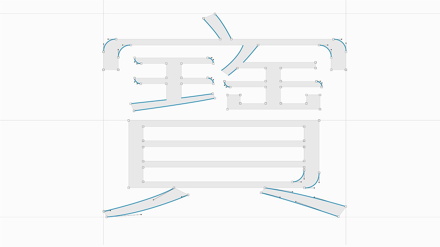
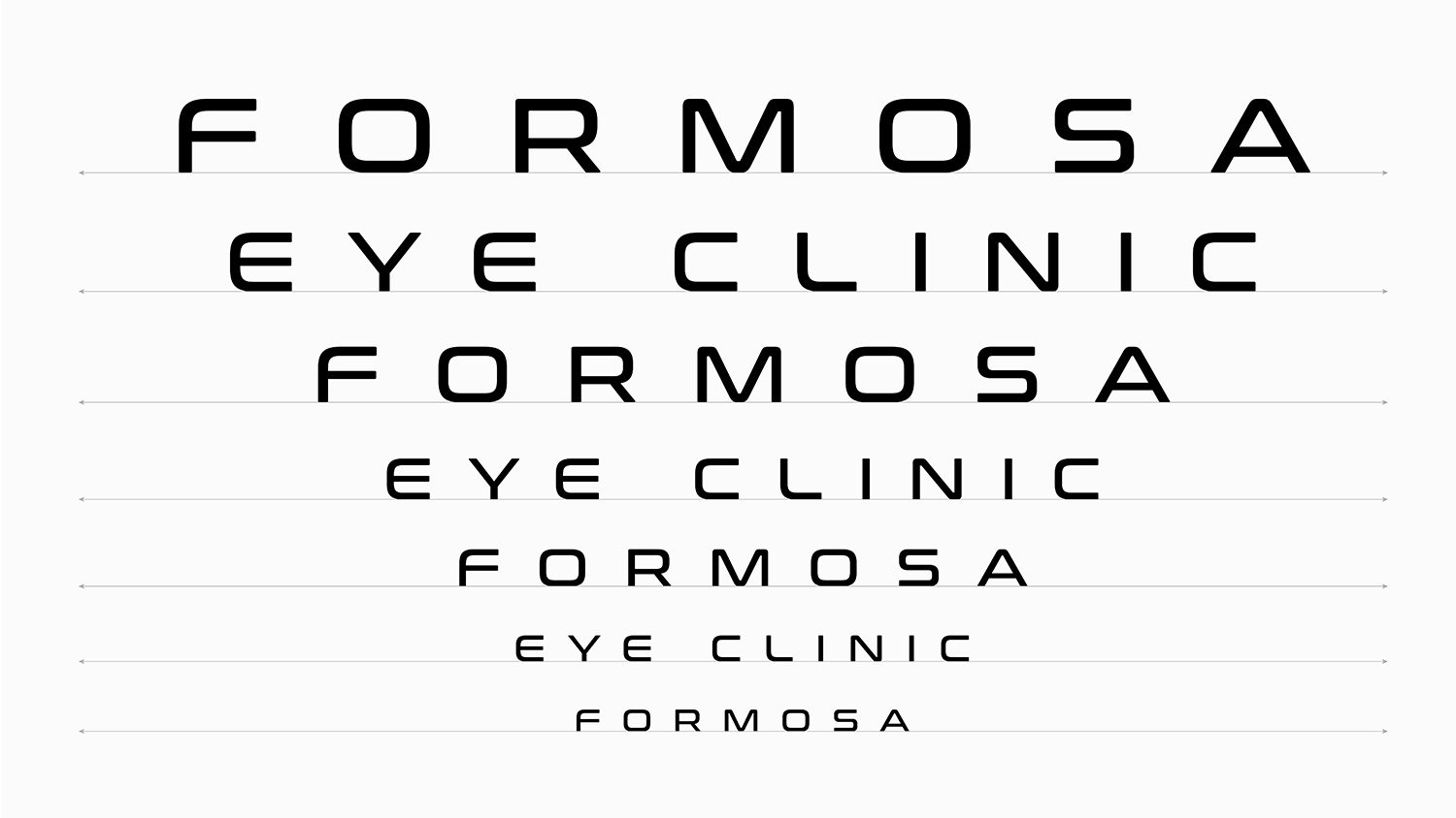
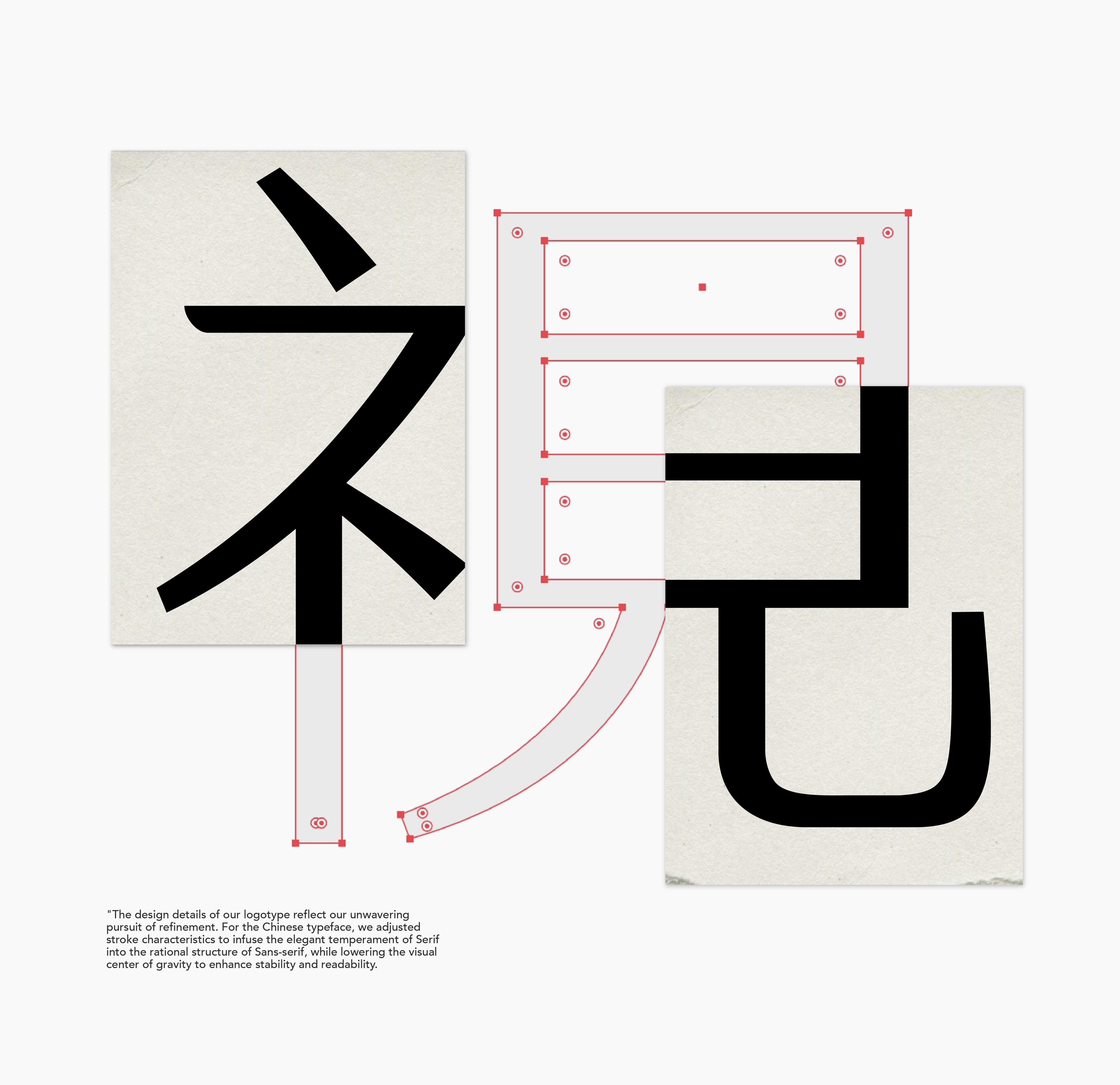
標準字的設計細節,體現了我們對「精緻度」的追求。中文字體透過調整筆畫特徵,在黑體的理性骨架中注入明體的優雅氣質,並壓低字體重心以提升閱讀的穩定感。英文標準字選用 Conthrax 字型,其獨特的扁平化架構與圓角細節,在展現前衛科技感的同時,亦保留了視覺上的柔和親切,精準呼應品牌兼容「科技醫療」與「友善服務」的雙重特質。
客戶|寶島光學科技股份有限公司
Formosa Eye Clinic originates from the household brand “Formosa Optical” in Taiwan. Building upon forty years of brand heritage, we aim to redefine the modern ophthalmic clinic’s image through a new visual language: “A professional medical environment that also serves as a warm guardian of
vision.” In the logo design, we deconstructed the letter “F” (the initial of Formosa). Through mirror symmetry and geometric restructuring, we subtly crafted the visual imagery of the Chinese character ” 目 ” (eye), intuitively echoing the essence of ophthalmology. This is more than just a visual pun; the enclosed structure, wrapping from left to right, symbolizes the concepts of “all-around protection” and a “vision shield,” conveying the