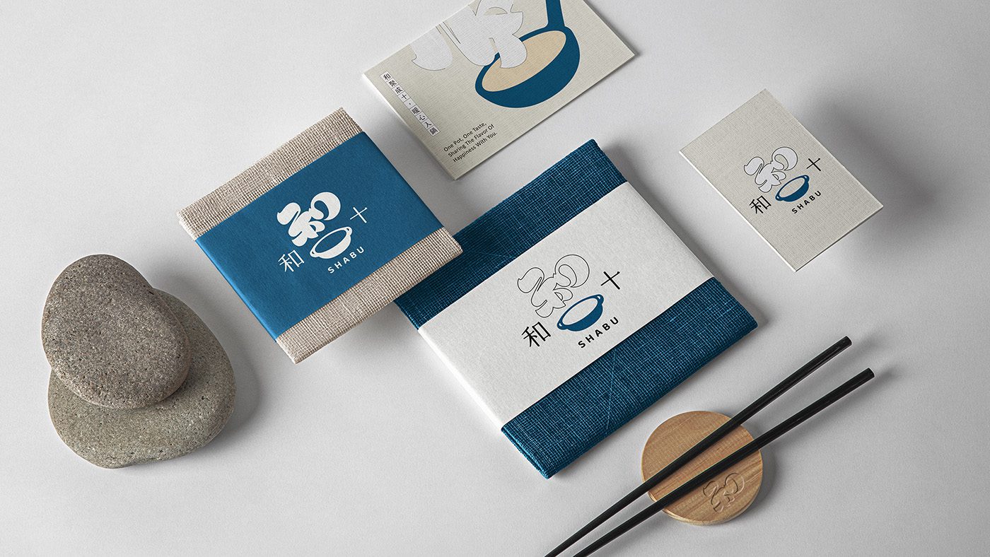
純正日式風味湯頭、嚴選鍋料食材、精心研發獨特醬汁,「和十Shabu」秉持日式職人精神,匠心為顧客打造美味的鍋物極致饗宴!
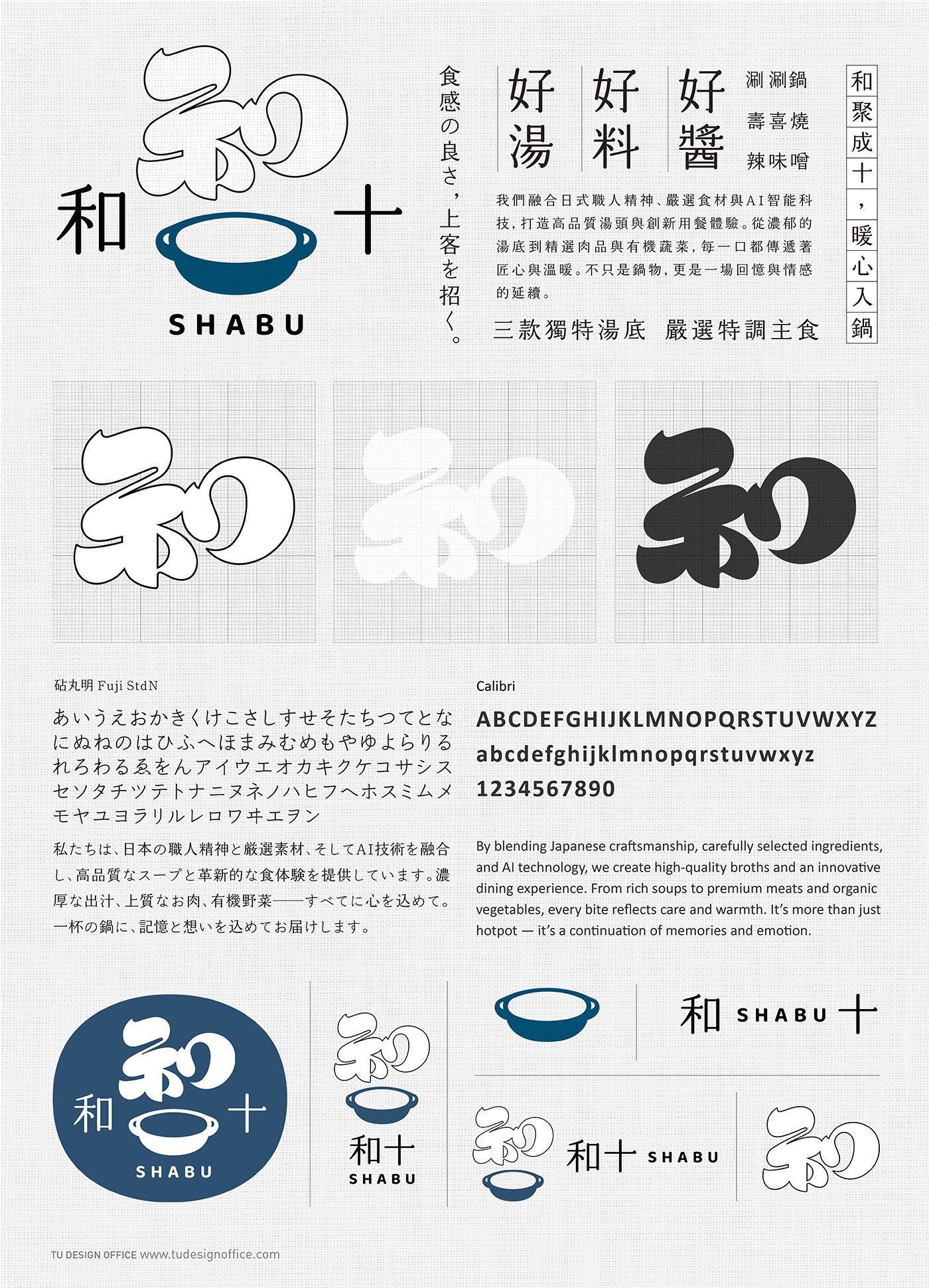
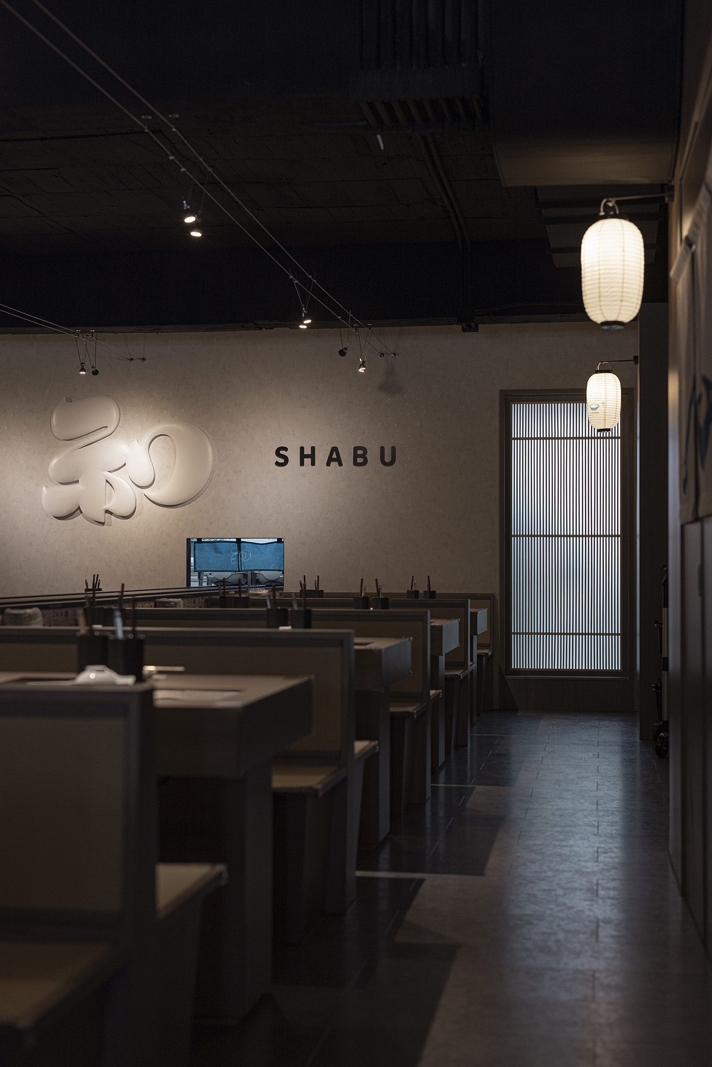
品牌標誌設計以品牌名中的「和」字為核心,透過煙霧意象轉化字形輪廓,如同鍋中湯氣緩緩升起,傳遞出溫暖柔和、悠遠靜謐的傳統日式品牌氛圍。此設計手法更延續至環境指標,包含廁所與員工室的中文字體設計,讓整體空間語境與品牌識別相互呼應,一以貫之。品牌主視覺設計,運用了簡約的線條與平面的插畫的結合,平衡傳統日式美感與當代年輕視覺之間的張力,簡潔中帶有細節,整體品牌形象圍繞日式禪意、溫暖、優雅、柔和,用以詮釋「和十Shabu」希望帶給顧客溫暖又精緻舒適的鍋物饗宴。
客戶|十承十股份有限公司
With authentic Japanese-style broth, strictly selected ingredients, and uniquely developed sauces, “WA-JU Shabu” upholds the spirit of Japanese craftsmanship to create an exquisite hotpot feast for customers. The logo design centers on the character ” 和 ” (Wa/Harmony), transforming its silhouette into rising steam to evoke the warm, serene, and tranquil atmosphere of traditional Japanese culture. This design language extends to environmental signage, including custom Chinese typography for restrooms and staff rooms, ensuring a consistent spatial narrative. The main visual balances traditional Japanese aesthetics with contemporary youthful appeal through minimalist lines and flat illustrations, interpreting a brand image defined by Zen, warmth, and elegance.