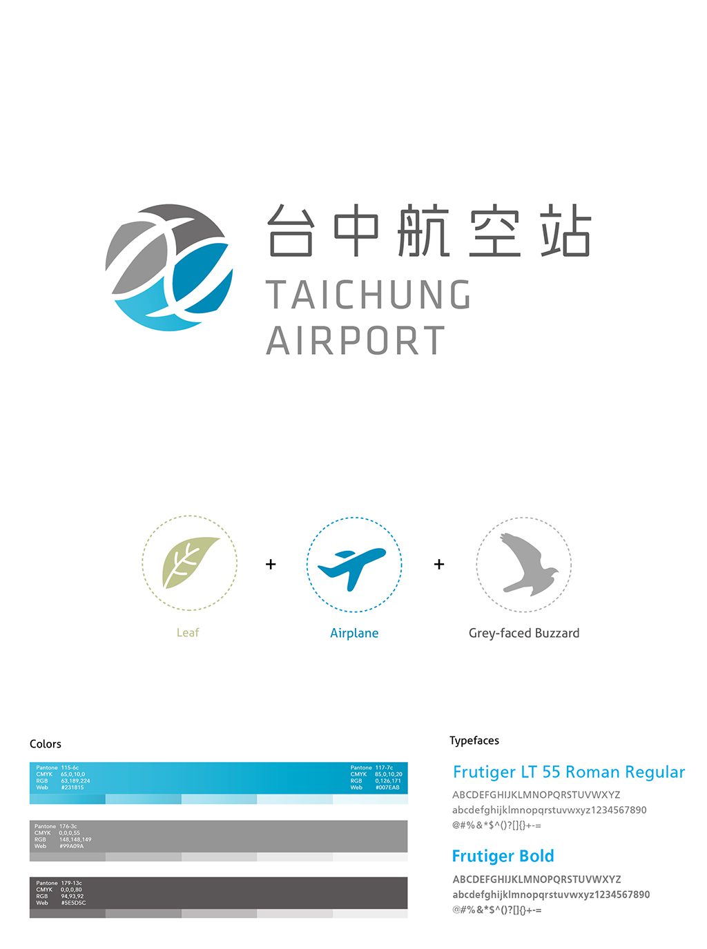
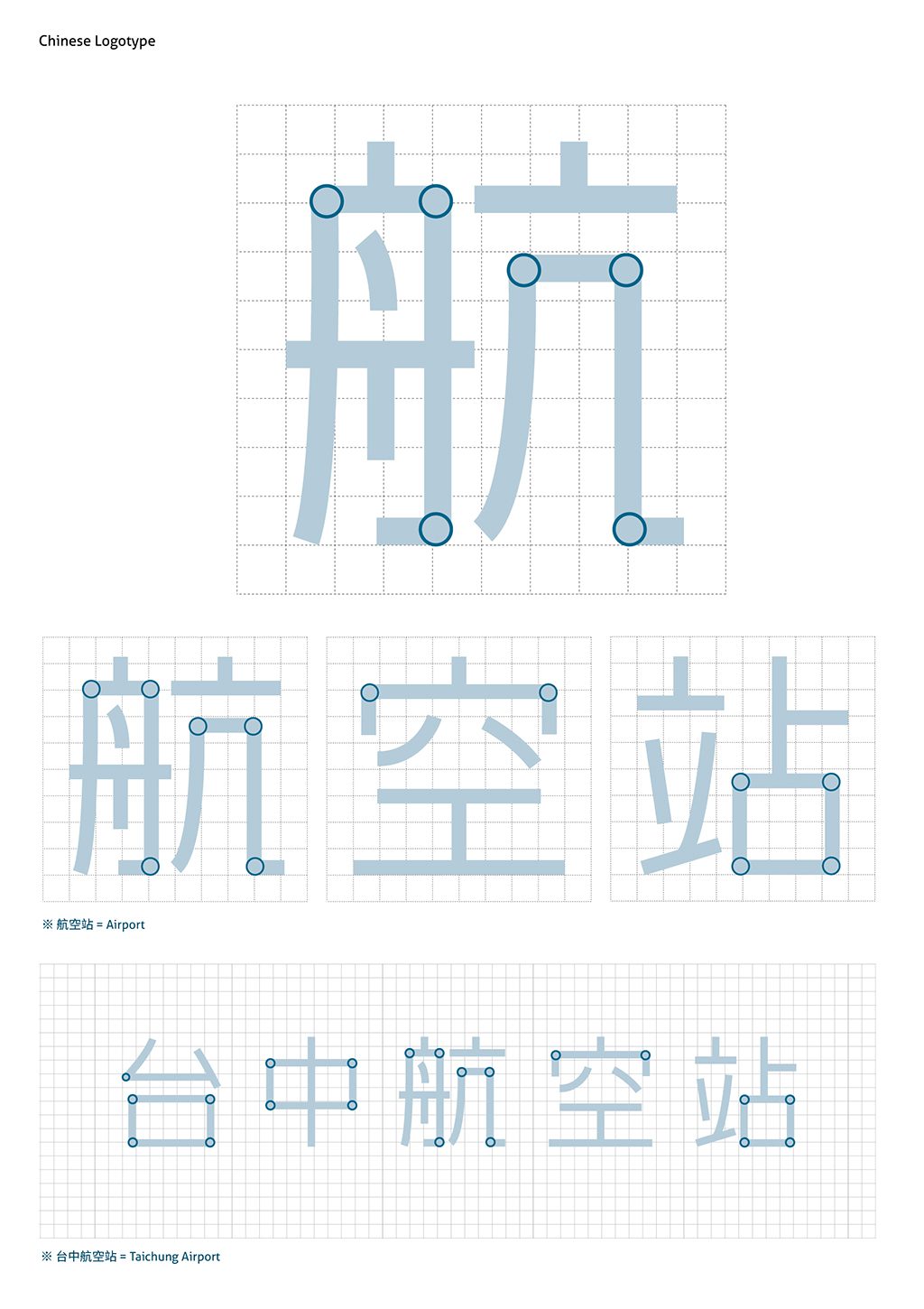
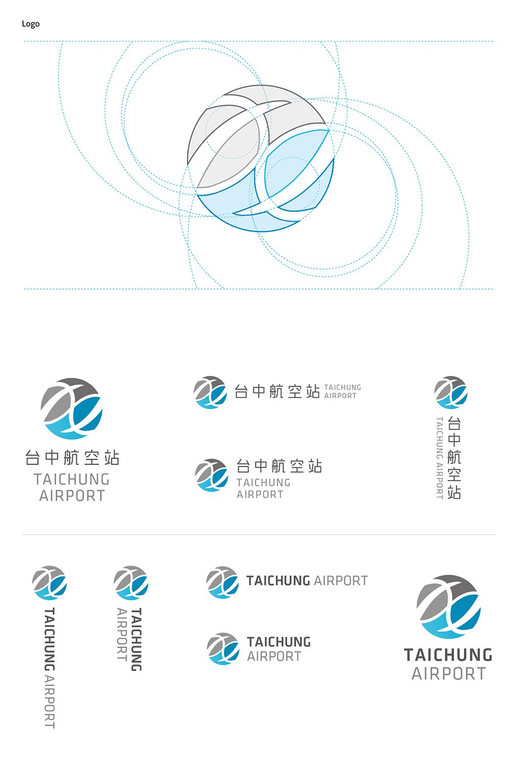
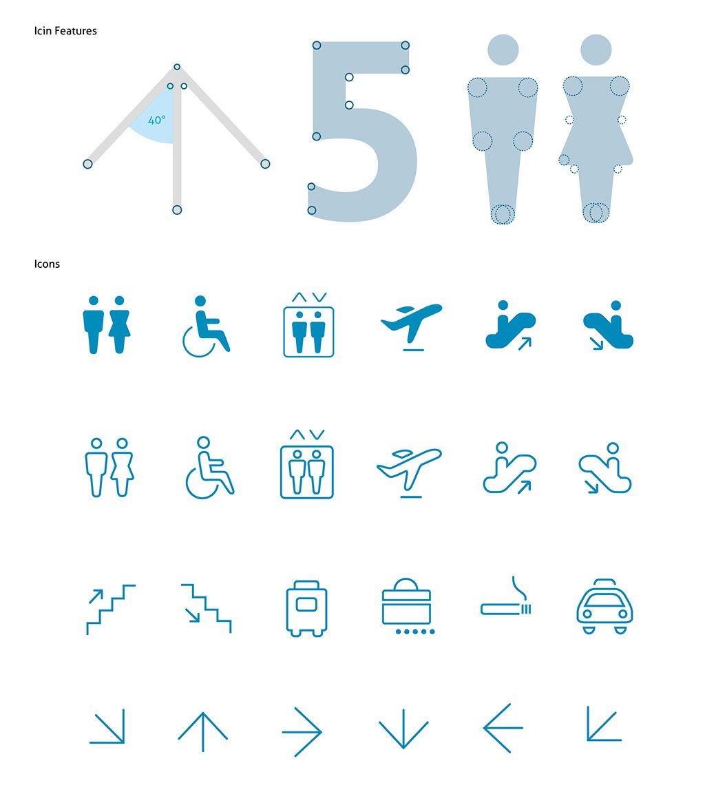
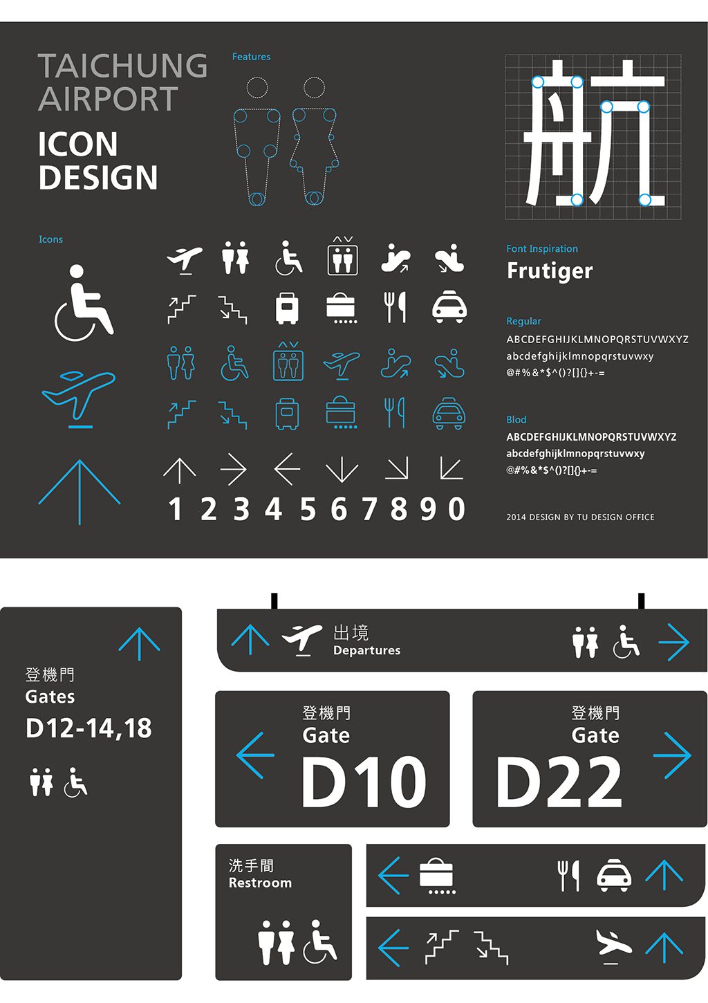
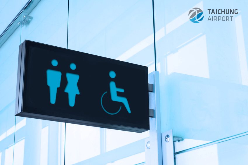
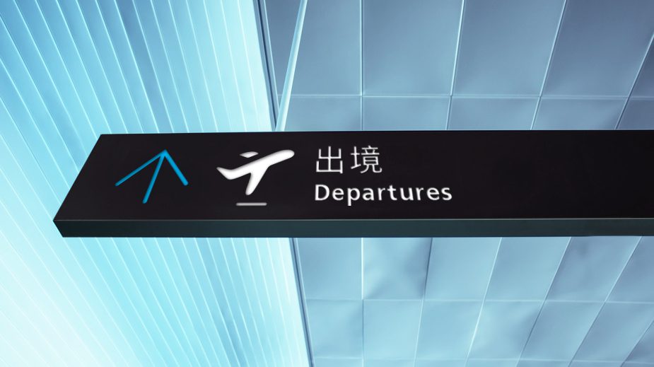
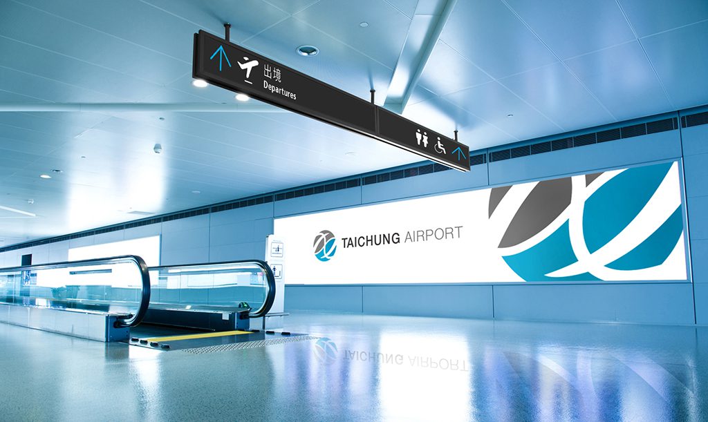
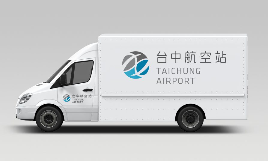
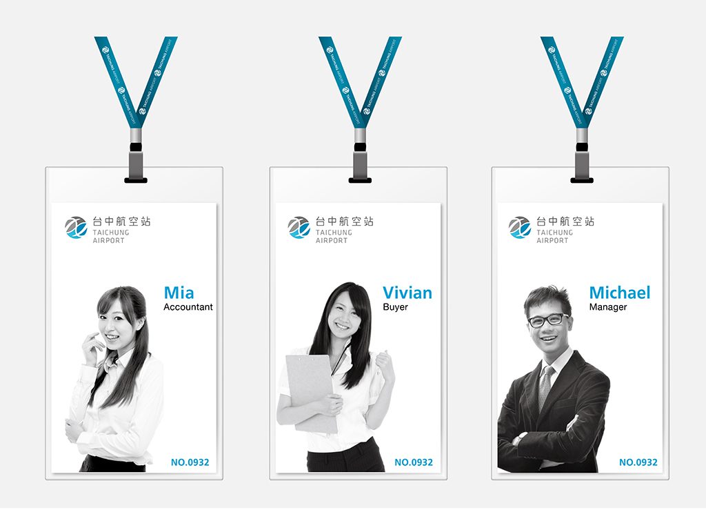
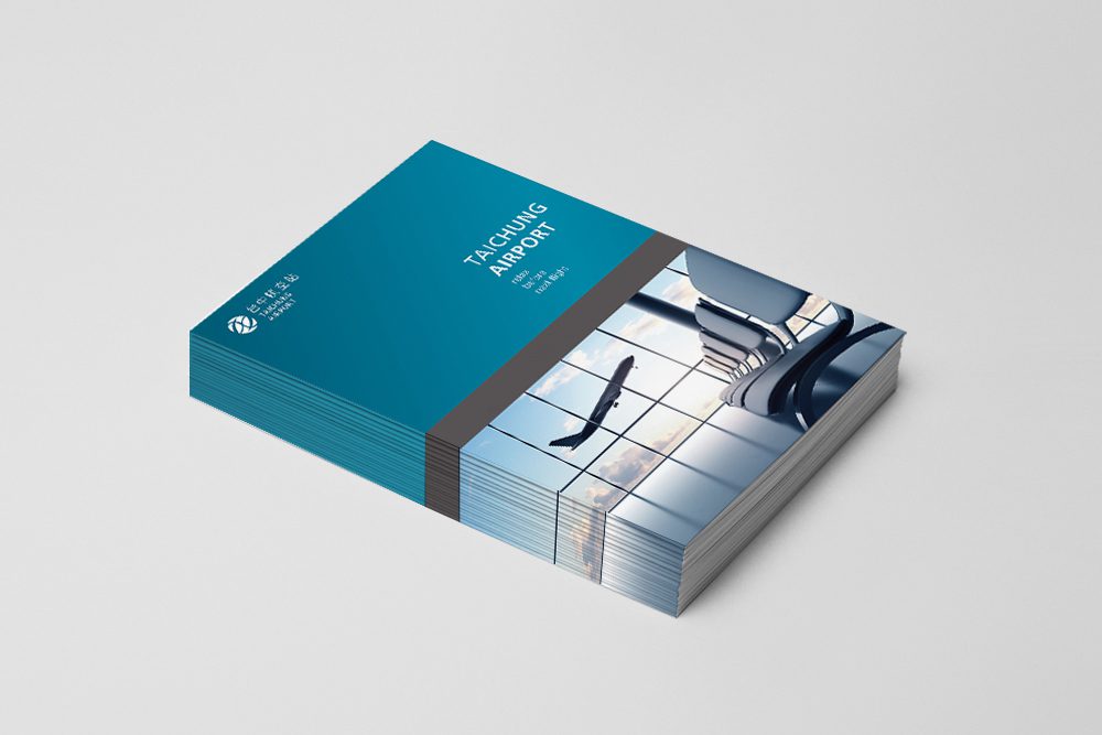
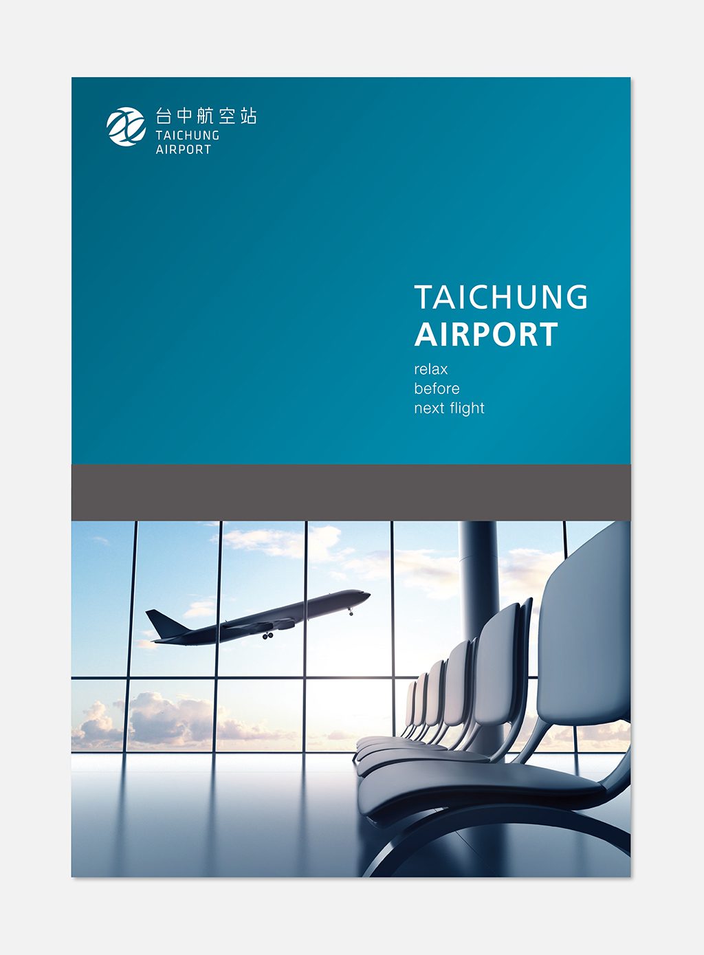
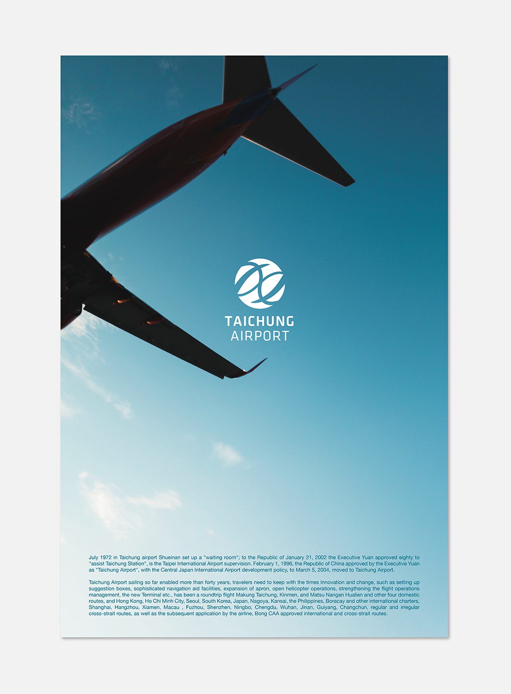
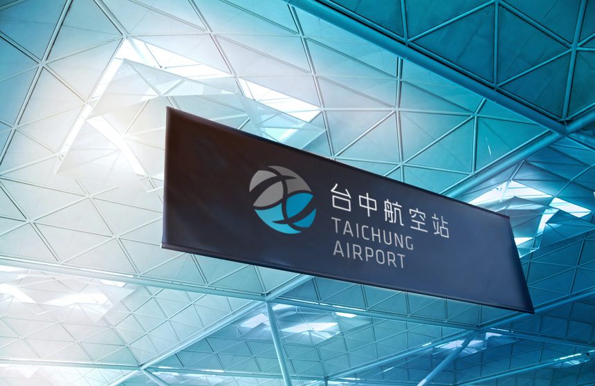
在Logo設計上 ,由於台中機場新國際航廈以綠能環保的概念建造,因此我們從葉子的造型出發,將葉脈以圖地反轉的手法節合飛機(藍色)與灰面鵟鷹飛翔(灰色)的意象,上下兩片葉子圖像相互結合成ㄧ個球體,象徵飛機的往返、永續的經營。 指標設計部分,配合Logo需呈現給人溫潤舒適的感覺,全部皆以圓角邊設計,並配合以高閱讀性聞名,國際機場常用字體Frutiger搭配icon使用,整體形象希望讓它儘量呈現清新簡約的機場意象。
*本套作品為未被採用之提案設計
客戶|台中國際機場
For the logo design, inspired by the green and eco-friendly concept of the Taichung Airport New International Terminal,we took a leaf silhouette as our creative starting point. Utilizing a negative space technique within the leaf veins, we integrated the dual imagery of a soaring airplane (in blue) and a gliding grey-faced buzzard (in grey). The upper and lower leaf graphics merge to form a sphere, symbolizing the coming and going of flights and the sustainable operation of the airport. Regarding the signage and wayfinding system, to align with the warm, welcoming, and comfortable feel of the logo, all elements are crafted with rounded edges. This is paired with icons and the Frutiger typeface—a font renowned for its exceptional legibility and widely used in international airports—to project an overall brand identity that is fresh,minimalist, and welcoming.
(Note: This concept was an unselected pitch proposal.)